April 2015 - September 2015. Worldwide. / Natural User Interface - Myo & Kinect. Web application /
Client: Adora. www.adora-med.com
Summary
ADORA is a complete, perioperative (pre, during and after operation) medical solution that empowers surgeons with a touchless assistant and a powerful Healthsuite. The team is creating a highly specialised product for surgeons, and they build it together with surgeons. I was invited after the team already launched the MVP.
Problem
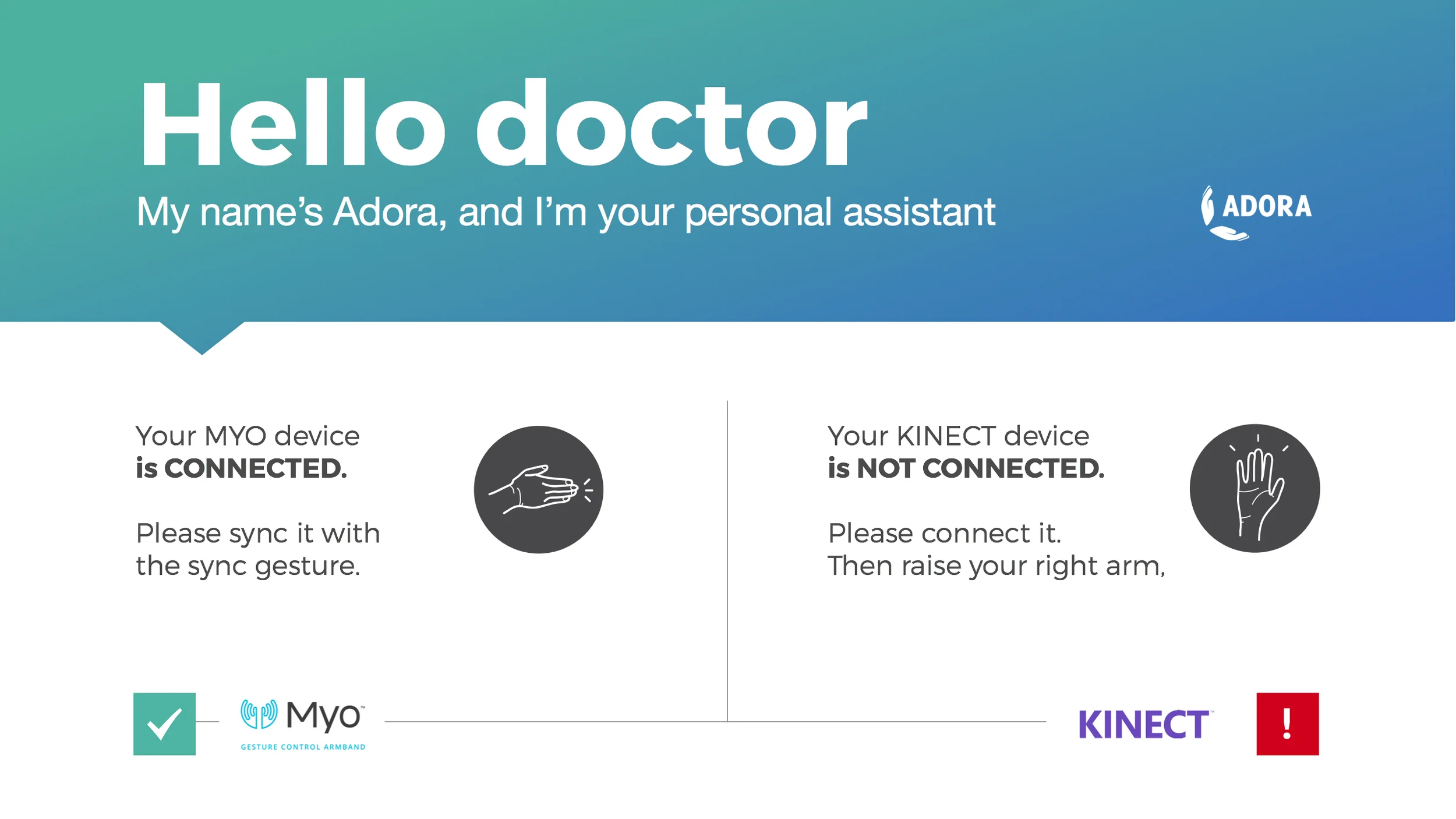
ADORA is using technologies such as Kinect and the Myo by Thalamic Labs. While they are powerful, they have rather steep learning curves. When your users are surgeons and clinicians, there is no time for learning and no room for mistakes.
Solution
The solution is a revamp of the existing user journey. Especially now that the guys added new devices such as the Myo. The redesigned interface tries to be universal so it can accommodate new devices and interaction behaviours. There is one user journey where users are on-boarded through a clean interface that is optimised for speed and severely mitigates risk.
My role
I stepped in as a product advisor helping the team with user research, product design (UX, UI) as well as product and brand positioning. My role was to revisit the existing user interface for the touch-less assistant and design the new solution.
Results
- MVP installed and running in hospitals across Europe
- Successfully closed a seed investment round in US and Europe
Walking in their shoes
I love working with expert users with specific domain expertise. I really do. That's why I was really excited to help the Adora team when they asked me. But as I was not with them from day 1, there was a lot to catch on.
Understand the journey. The whole journey
Yes, the guys invited me to help with two things: with the UI for their touchless assistant and to help them pitch their story. But what we did instead was start with the basics. The whiteboard and silly questions.
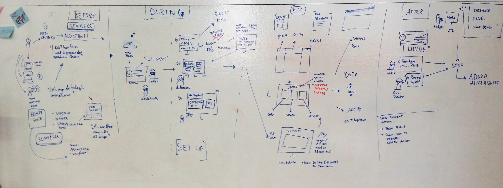
We draw several user journey maps together with the team and I did at least 20 more on my own before I was sure, I get the whole picture.
Perioperative = before, during and after.
Perioperative generally refers to the three phases of surgery: preoperative, intraoperative, and postoperative. The goal of perioperative care is to provide better conditions for patients before operation, during operation, and after operation.
Adora as a complete solution covers all three stages, although it might seem they focus mostly on the touchless assistant and the intraoperative phase.
User stories
Once we get the general user journey right, I started to write quick user stories, little scenarios specific to certain cases. The idea behind it was to cover all angles and edge cases.
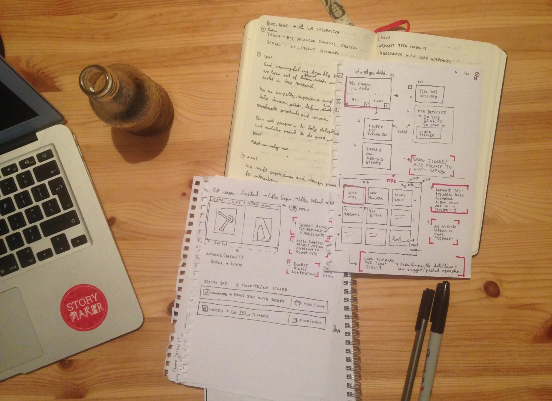
Design and prototype
After the stories, I started sketching key interactions with one goal: to identify key functionalities and hide away all the non-essential ones.
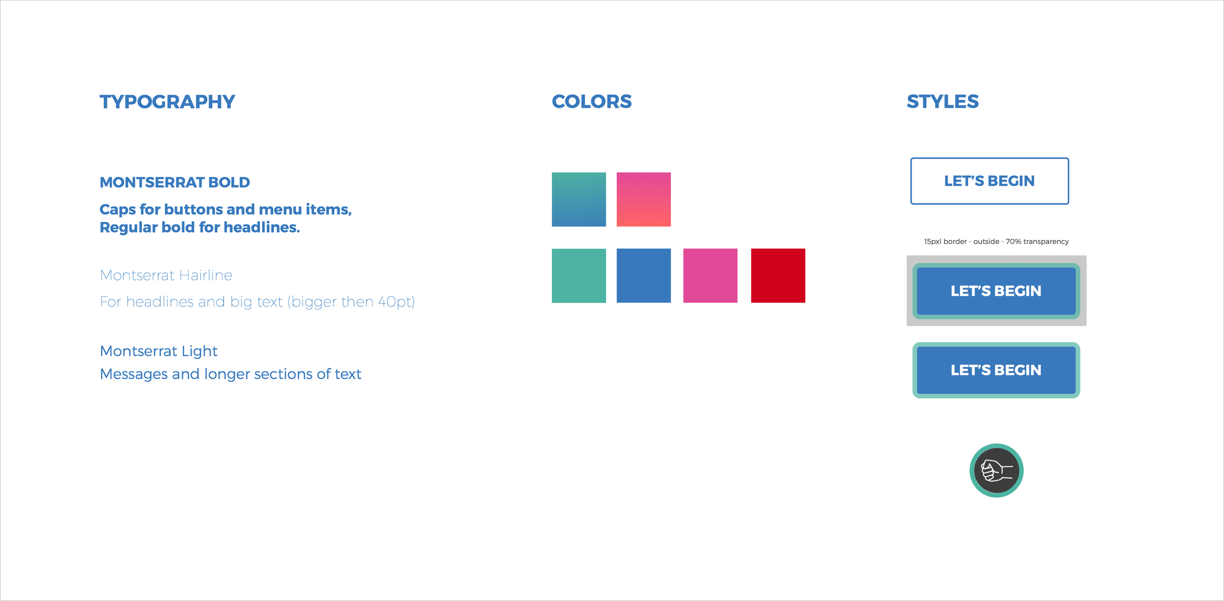
Design language
It was crucial to develop a clear design strategy and a visual language the guys could easily implement accros the whole Adora solution.
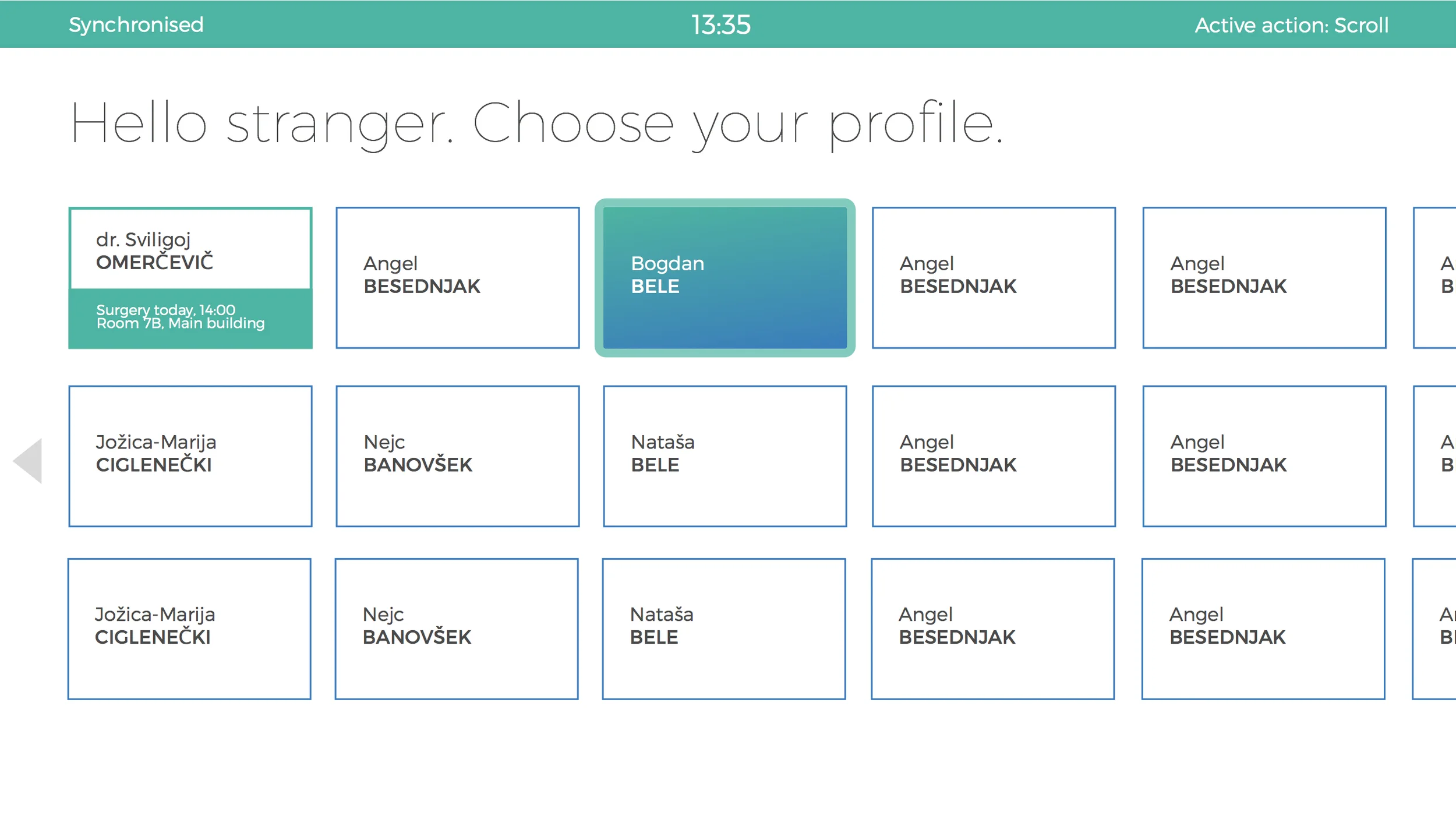
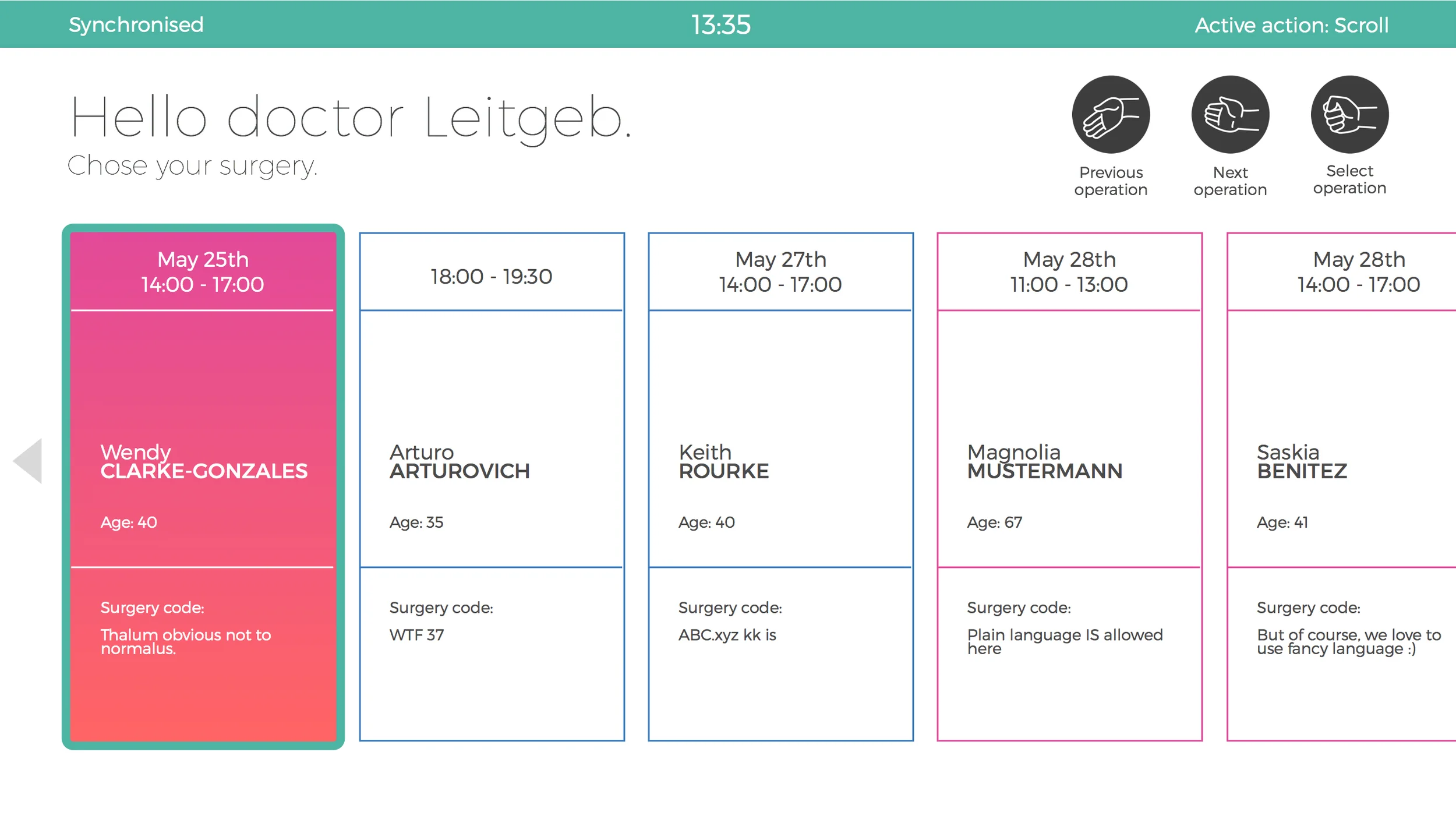
Onboarding and Notifications
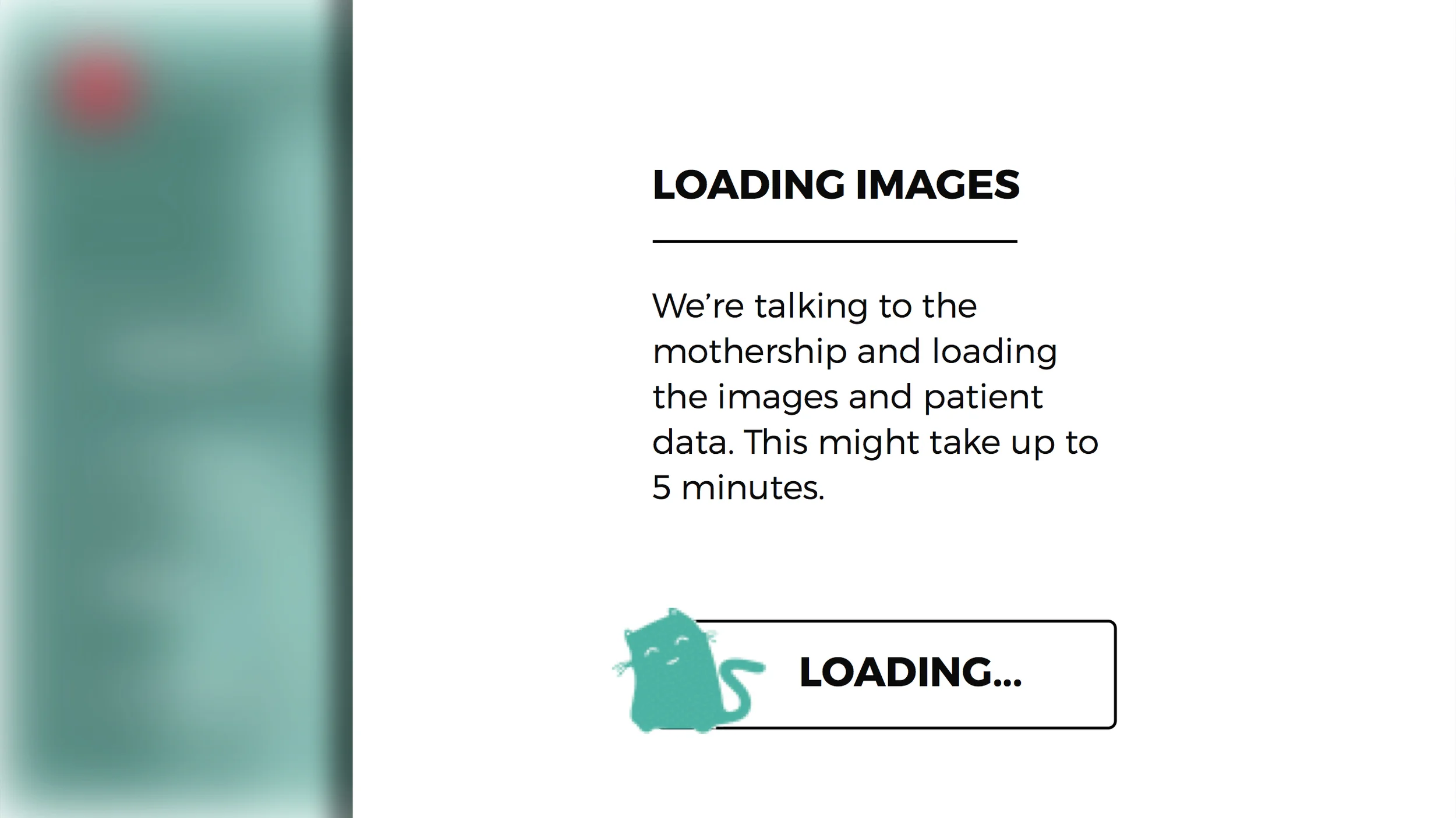
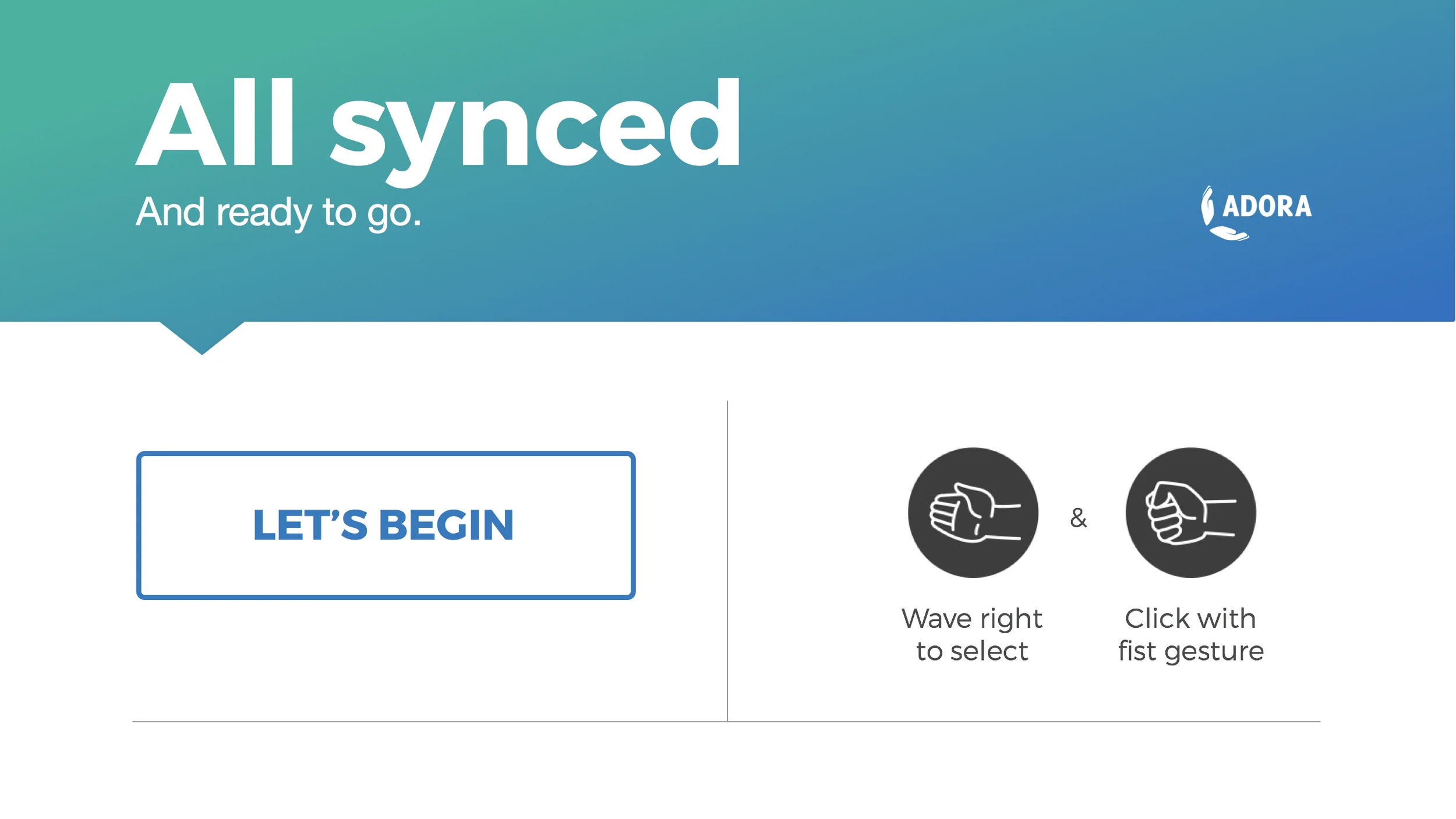
Onboarding the users was key from the beginning on, so we considered it even before starting to sketch the new UI. How do we explain the flow, the natural interface, the gestures?
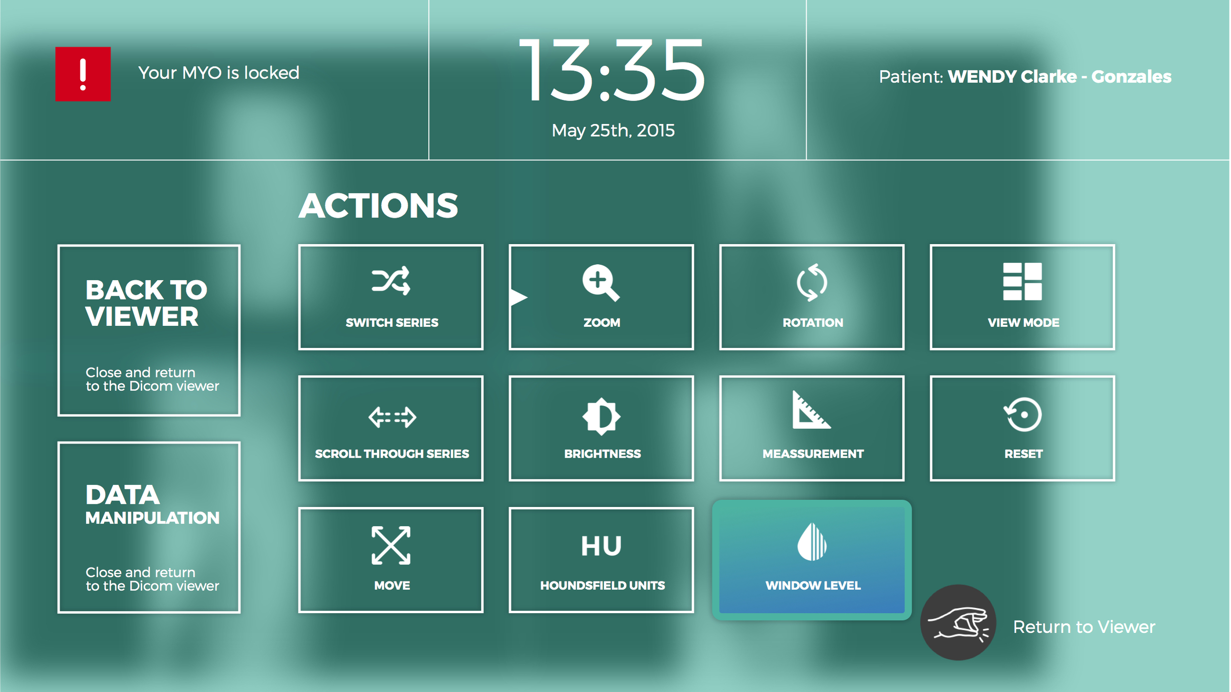
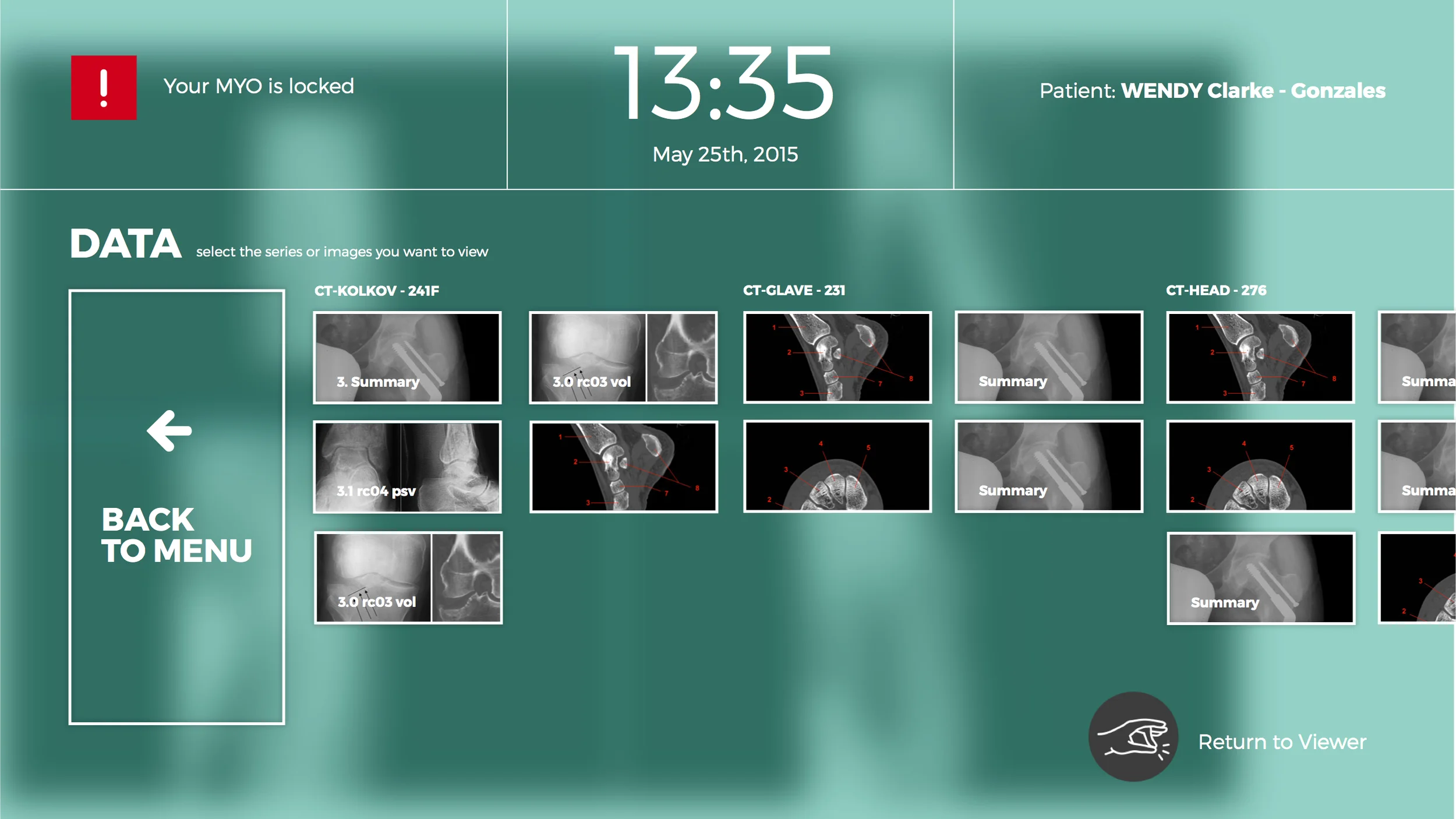
Another challenge was the notifications and messages. For example, the UI needs to communicate that the system is loading a huge chunk of images which can last up to a couple of minutes.

UI flow
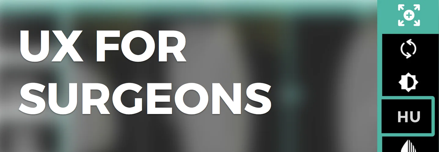
My goal was to propose a UX concept, a strategy really, that would help the guys plug in any new input gadget such as the Myo (by Thalmic Labs) or Kinect. So, I proposed a generic user interface that offers a common entry point for any member of the surgical team.
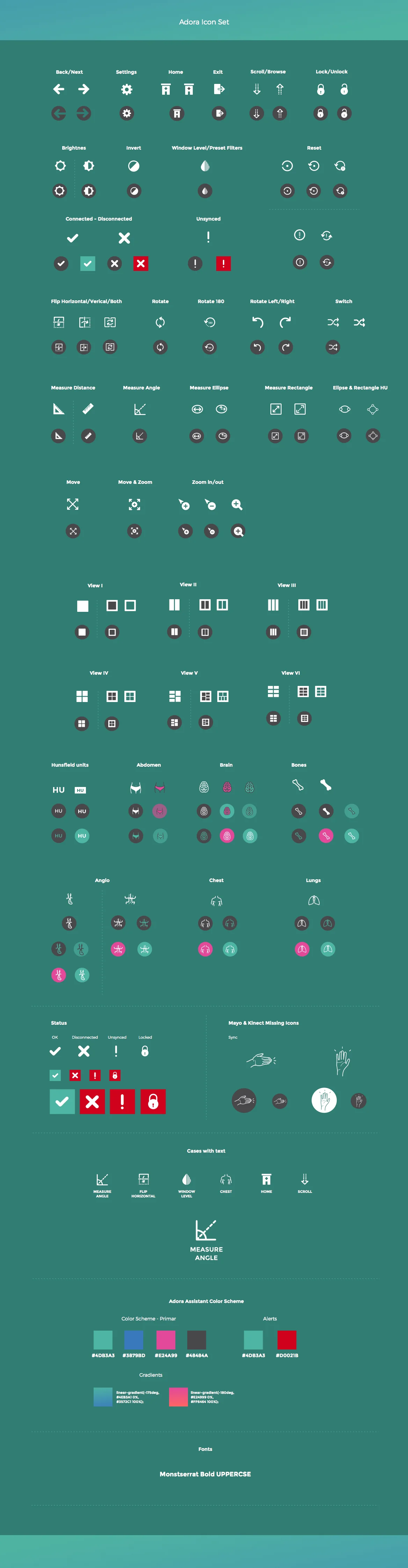
Iconography
Another key element was iconography. The icons needed to be easy to be self-explanatory, bold and as clear as possible. Together with Marusa we designed a new set of icons while keeping the labels underneath the icons.